The Items Chart is the third chart on the project Dashboard. It helps project teams visualize Item costs on their projects, broken down by different categories and Item Status.
Items Chart Views
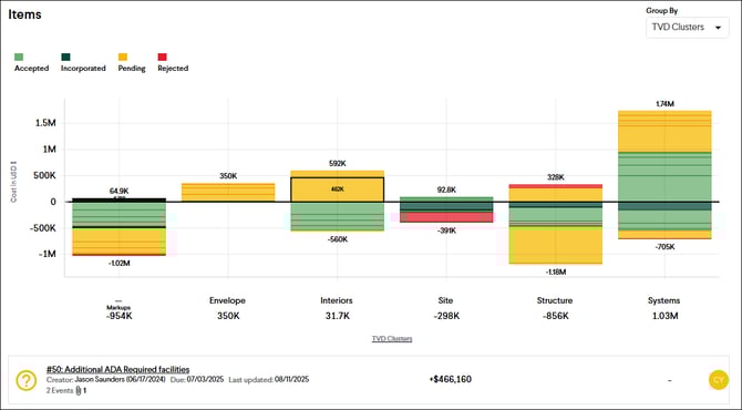
The Items Chart displays how the cost of Items is broken down for each category. Item costs are displayed as adds and deducts and are color-coded by their current status. The Items Chart can be quickly pivoted to break down Item costs by different custom categories by grouping and filtering the chart. Hovering over a bar in the chart displays a summary of the Item below. Clicking the bar will open the Item Details view of that Item.
Tip: Be sure to categorize your Items into different categories to maximize the benefit of this chart.